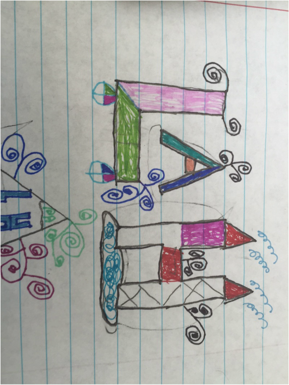
I am working on my personal logo and I need to improve because this one is way toooooo cluttered:
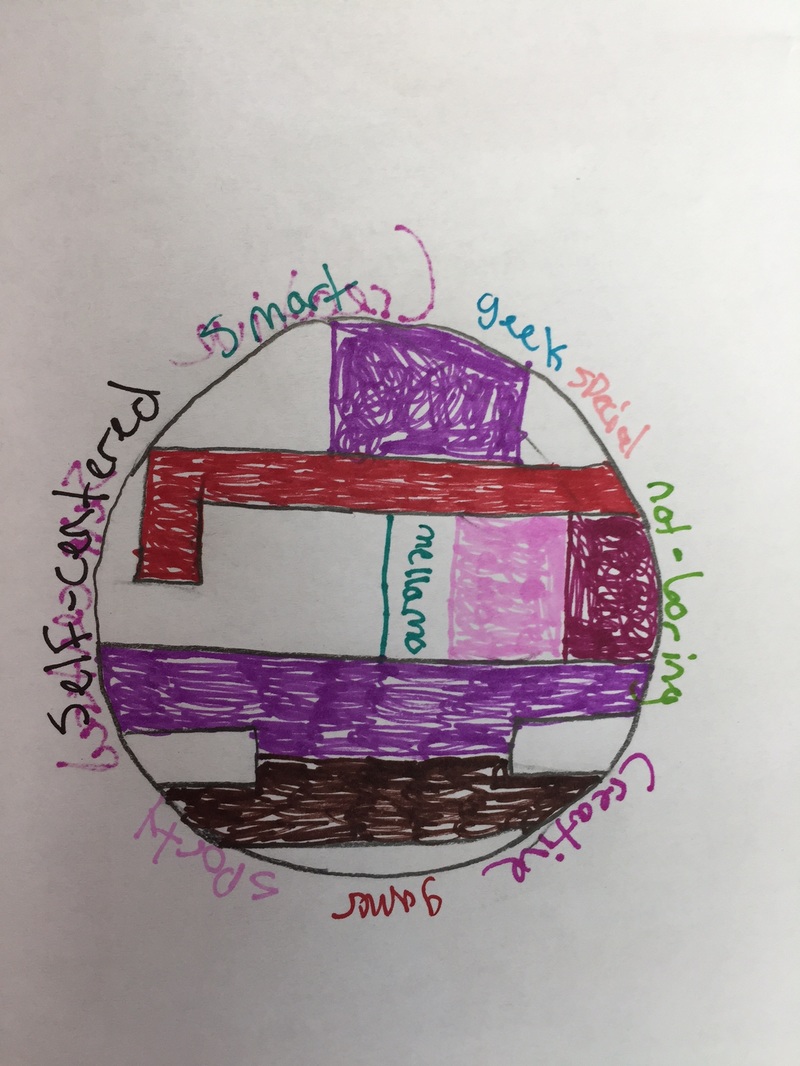
When I redo this assignment than I will choose something way more simple and easier to read. I will most likely choose a easier design.
After about 3 ripped pages I finally said that this was my second draft but this one wasn't the best either when I redo this I will tr and use a lighter color to make it easily seen. I will try do this on a google drawings.
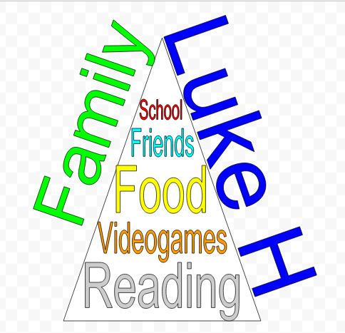
So for my final I went a complete new direction and I choose to do it with the best one on top and the least ones on the bottom of the triangle. I tried to use simple colors to make it pleasing to the eye